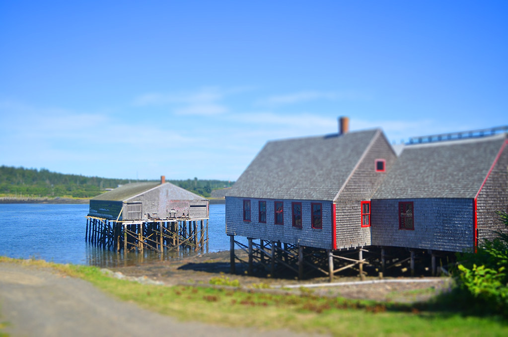
I’m not a huge fan of photography gimmicks. If an image can’t stand on its own without tons of Photoshopping & weird filters, then it’s probably not a great photo. I used to use a lot of filters to cover up the fact that my photos just weren’t very good. I’m still learning, and I wouldn’t say my photos are awesome yet. But, I am MUCH more confident in my skills and I find that, aside from tweaking white balance and exposure or making them black & white, I don’t have to do much to make my photos look the way I want. That having been said, I think that it’s really important to play with my photos sometimes.
I recently discovered that Adobe CS6 has a built in filter called “tilt-shift”, which is often applied in the world of photography in such a way that it makes buildings and landscapes look miniaturized. I also downloaded a tilt-shift action for Photoshop from AJ Troxell. While none of my scenes really look “miniature,” I do think that the tilt-shift effect (when applied sparingly) can actually make a photo look more dynamic and interesting. The first photo I used the CS6 filter, and for the others I used the action. The action made my photos super-saturated, but I toned it down quite a bit because I’m just not a huge fan of that look.
Latest posts by Kelli Ann Wilson (see all)
- our common hours - October 14, 2016
- september - October 1, 2016
- 28 // 52 - August 31, 2016
- in the woods // a happy childhood - August 30, 2016
- 25, 26, & 27 // 52 - August 30, 2016


